A quiet foundation
Space, generous type and two contrasting surfaces. Precision creates a premium feel, not decoration.
Visual identity / 2026
Quiet typography. A human touch. Well-timed humour. A guide to staying true to yourself — on the website, in a presentation and in the very first hello.
Explore the guide
Confident. Considerate. Full of character.
01 / Identity
A host who lets people be themselves. The visual language carries the same feeling: confidence without pressure, character without noise.
Space, generous type and two contrasting surfaces. Precision creates a premium feel, not decoration.
A brief chalk note, a candid photograph, a gently imperfect outline. Every detail supports the message.
Asymmetry in composition. Clarity in reading. Body copy and navigation always stay straight.
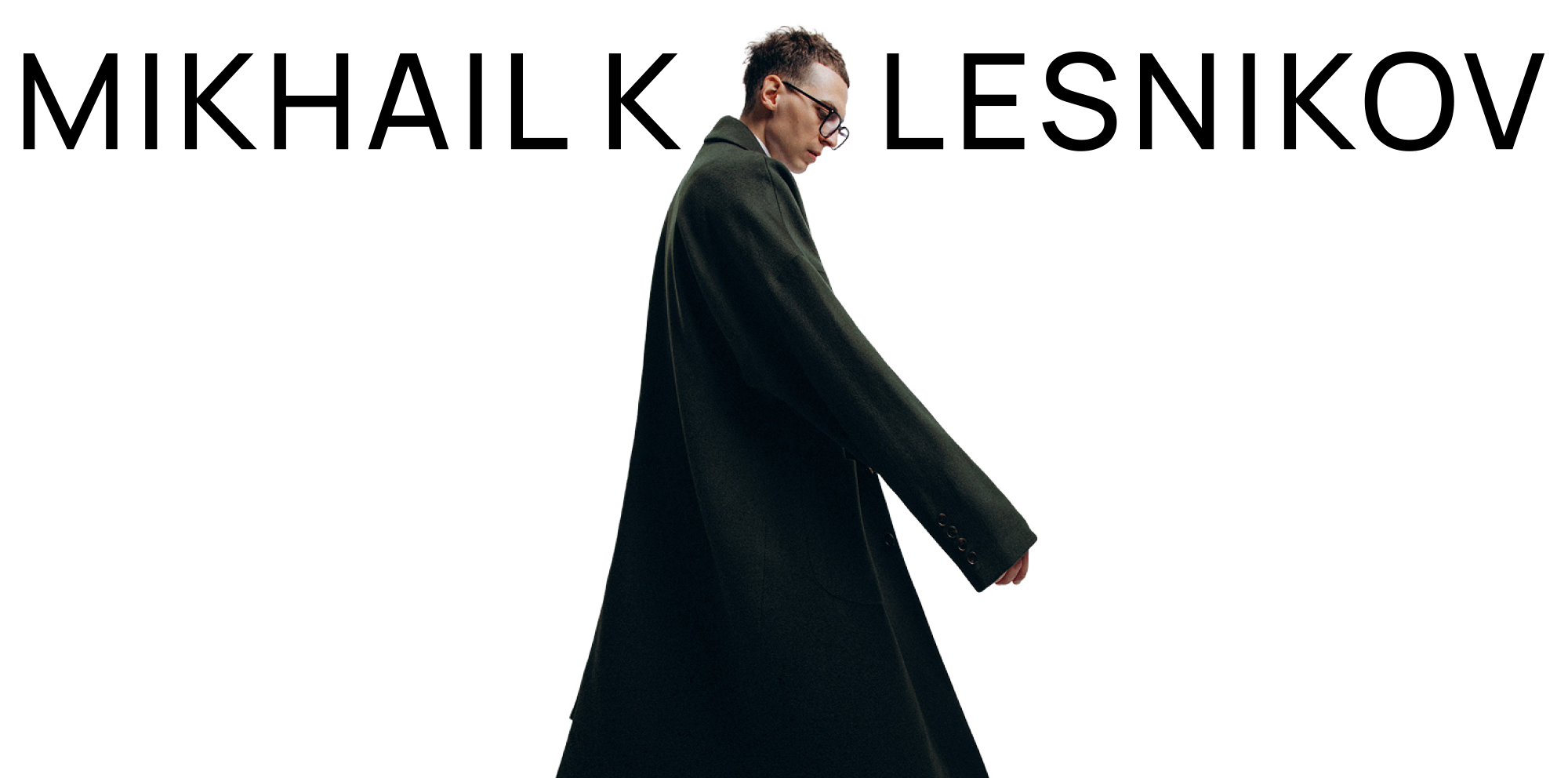
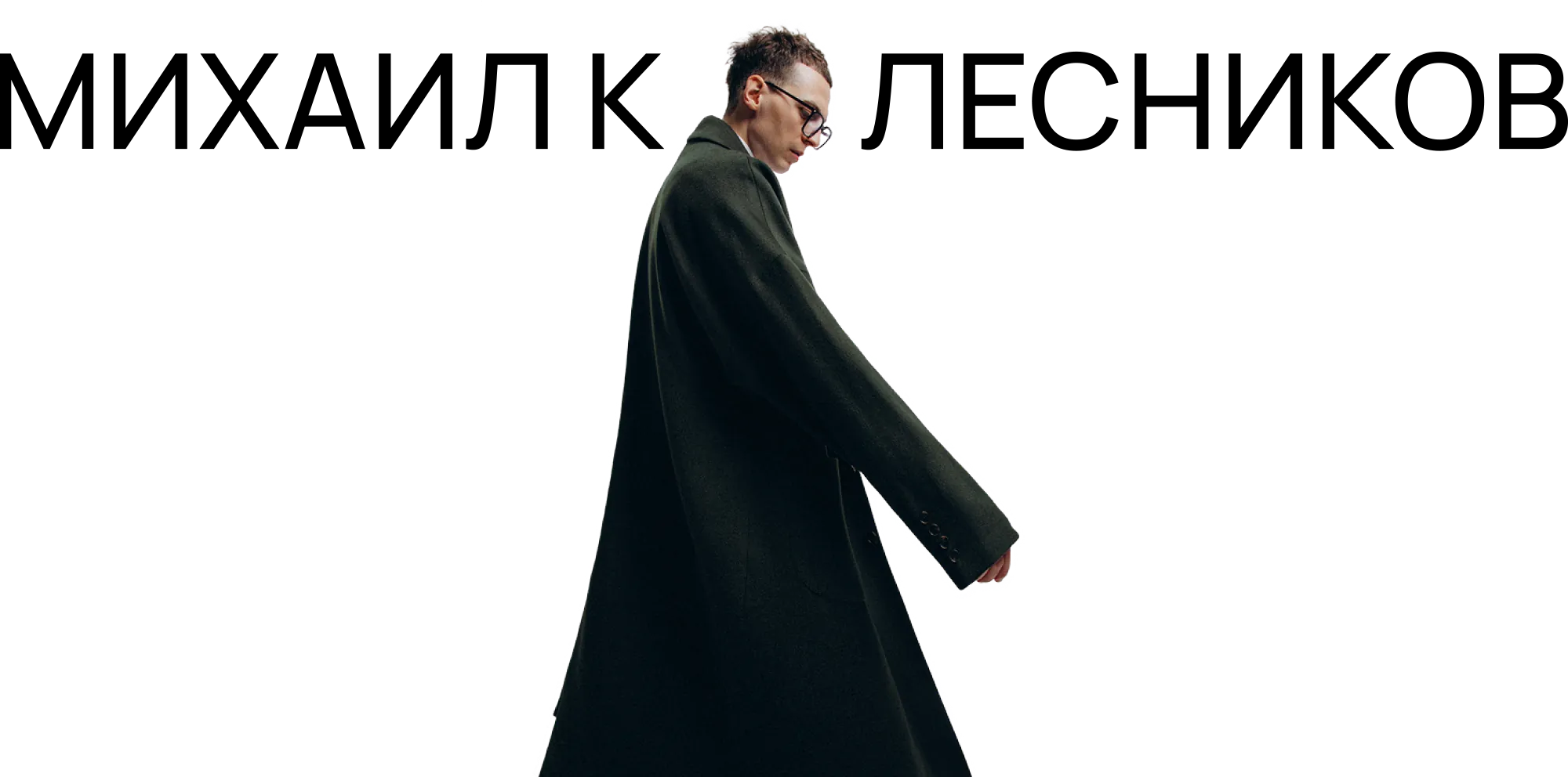
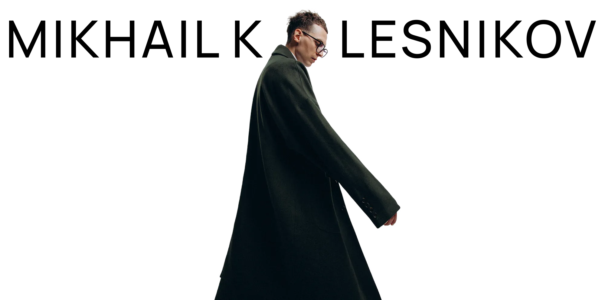
This is a composition, not a set of independent letters. The portrait replaces the “o”; the “K” sits behind it. Use the site's current assembly; never stretch or rebuild it by eye.
For new layouts, leave at least one capital-letter height around the name. The hero follows its own established composition.
02 / Colour
Light → dark → light. Colour remains an accent, not another full-screen surface.
Body text: ink on paper, or paper on ink. Avoid sky blue on light backgrounds and #F2211D for small text. Use the dedicated accent pair for notes on light and dark surfaces.
03 / Typography
Manrope provides structure. Misha Chalk Note adds a human voice. They do not compete for attention on every line.
Foundation · text and navigation
Medium 500 for headings and navigation; 400–450 for paragraphs. Navigation stays straight, without chalk texture or decorative distortion.
Accent · brief notes
Our font derived from the original hero lettering. RU/EN, numbers and arrows. Brief phrases only; never paragraphs or interface copy. Lowercase uses the same drawn forms as capitals.
Manrope Regular (400), Medium (500) and Misha Chalk Note. Desktop TTFs, web WOFF2s, installation instructions and rights information. No font installation is needed to view the PDF.
Download fonts TTF + WOFF2 / ZIPRead the room.
Text stays in this tab. Nothing is saved or sent.
Large. Quiet.
34–64 px · 500 · 1.04We start with what matters to you, not with a programme.
15–17 px · 400–450 · 1.7yes, sound helps
16–23 px · 400 · 1.504 / Photography
Real photographs of Mikhail. In the studio: silhouette and character. At events: eye contact, reactions and connection. Never pass a studio portrait off as an event photograph.


People before frames.
05 / Details
An arrow guides. A frame highlights. An underline adds emphasis. Decoration is not a way to fill space: space has a job too.
A small shift, a slight turn, a gentle lift. No scroll hijacking, cursor chasing or endless motion. Touch and reduced-motion visitors get a calm layout.
Hover or focus ↗Read the room.
a little livelier, not louder
06 / Voice
In the first person. No grand promises or packaged “unforgettable experiences”. Be specific, keep humour kind and invite without pressure.
A good evening should never feel forced.
An unforgettable event of the highest standard!
Hi, Misha! Shall we work together?
Submit an enquiry to request a consultation.
An introvert is a guest. Not a special assignment.
We will get even your most boring guests going!
Laugh together. Never at someone's expense.
07 / Mockups
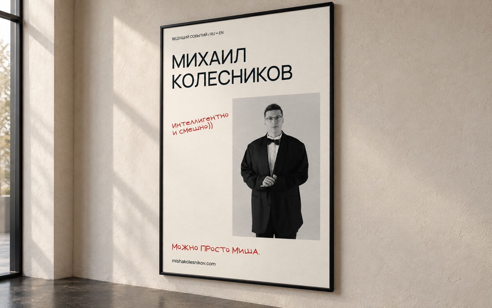
A poster, a badge and a phone screen. Three ways the same character translates across different formats.
01 / PRINT / POSTER
A clear name, a composed portrait and a human aside. The poster introduces a person, not a generic promise of a great party. Photography and typography each have room to breathe.
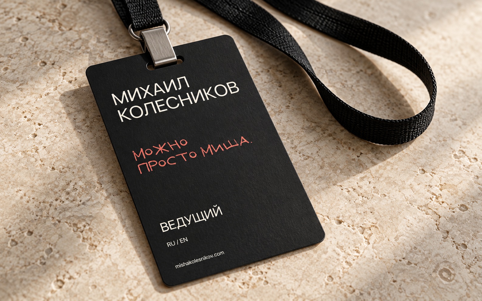
02 / PRINT / BADGE
Deep ink, a light name and one chalk phrase. The role reads at a glance, and the introduction feels informal. A matte surface keeps the identity understated.
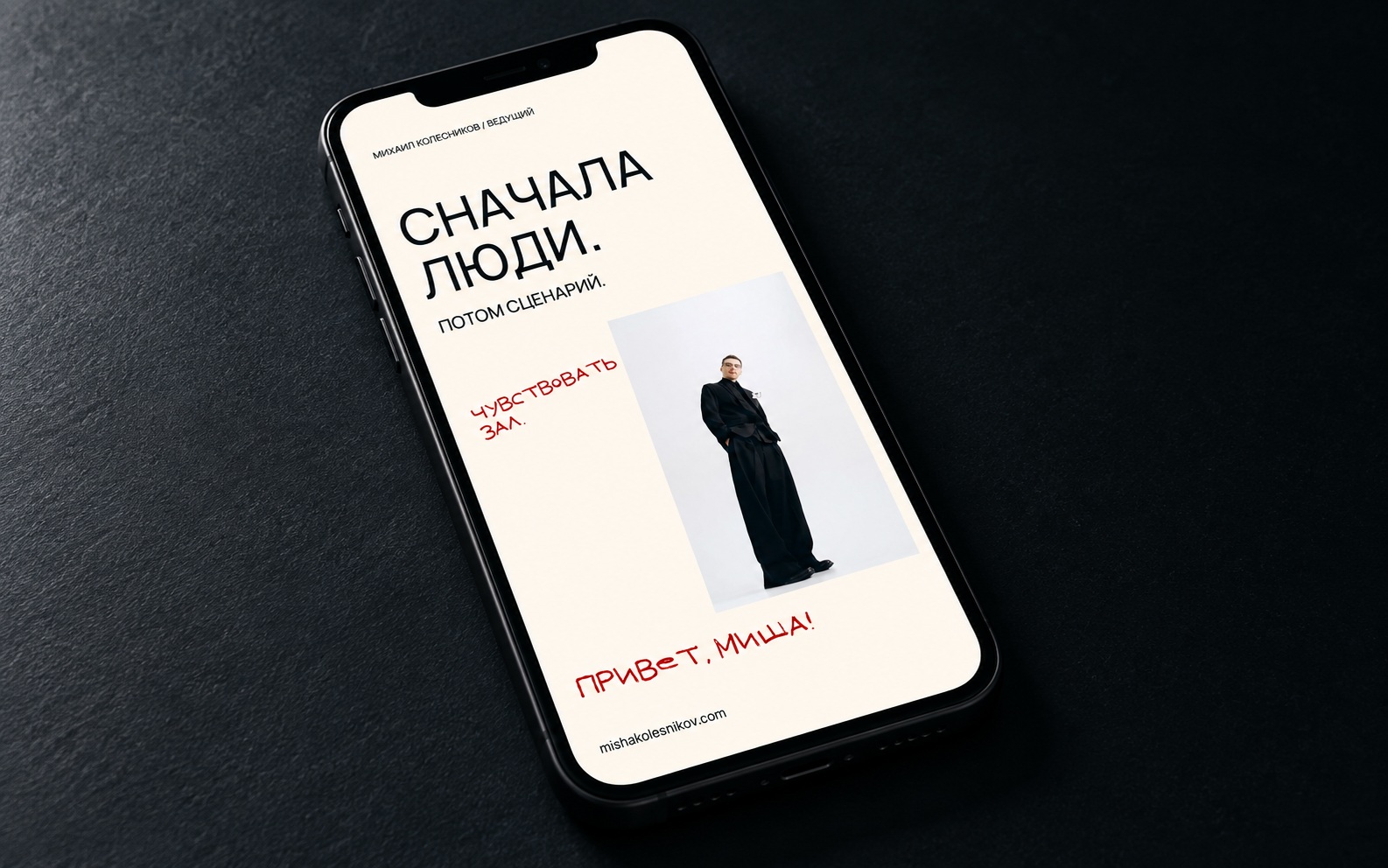
03 / DIGITAL / SOCIAL
One thought per screen. A generous headline, a real portrait and a brief invitation to talk. The same visual language in a vertical 9:16 format.
AI-generated concept visualisations, not photographs of actual placements. The artwork shown is in Russian. JPGs are suitable for approvals and presentations; they are not editable or print-ready files.
Download all mockups ↓3 JPG / ZIP08 / Assets
Open resources for organisers, designers and partners. Signature artwork, lettering and usage guidelines in one place. No sign-in required.
Manrope Regular (400), Medium (500) and Misha Chalk Note. Desktop TTFs, web WOFF2s, installation instructions and rights information. No font installation is needed to view the PDF.
Hero files are source layers. Final spacing and overlaps are defined by the site's CSS. Reproduce the complete hero assembly, not a single file. Existing rights to artwork and photography remain unchanged; converting lettering into a font does not grant a new licence.